Example · Bold & Dynamic
How the Hawks stole Game 6 — visualized
How a sportswriter's Game 6 breakdown became a single dramatic visual in one refine move. Real input, real conversation, real edits.
Note: This is an illustrative example. All input data and figures are fabricated for design demonstration.
PersonaSports writer · NBA columnist|wants to turn his Game 6 breakdown into something readers can absorb in a single scroll, before the takes pile up.
Input
“THE 18-POINT HOLE. Game 6 — How the Hawks Stole the Series. 3:47 left in the third. Hawks down 78–60. The broadcast had already cut to a graphic about offseason questions…”
infographicAI
Your infographic is ready. Tell me what to change.
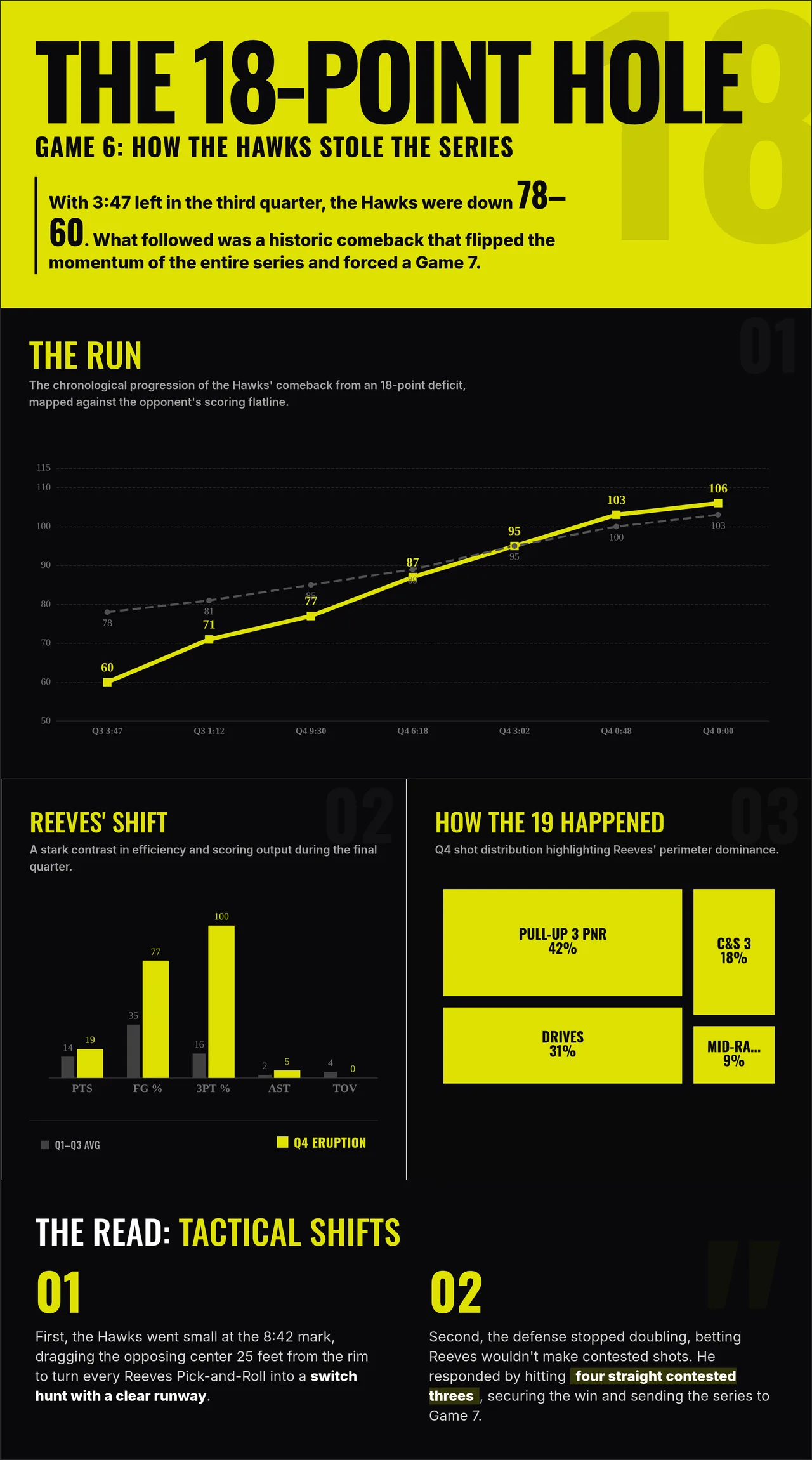
Refine 1
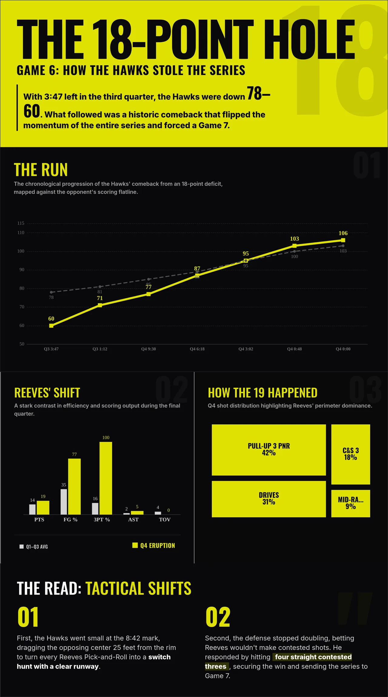
In the Reeves' Shift section, change the gray bar charts to a lighter gray. The annotations on the gray bars and the PTS, FG% header row should also become light gray.
infographicAI
New version generated.
Start with this breakdown, in the same style
We'll prefill the input and pre-select Bold & Dynamic. Edit anything before you generate.
Try this exampleMore examples
All examples use illustrative figures for design demonstration.